_________________________________________________________________________________
This brief asks me to "Design, develop and produce self branding that effectively communicates and promotes you as an individual, designer and learner." It is important that my project reflects who I am so I would like to explore media that I have done this year focusing on those I enjoy most. I must also think about how I portray myself as this brief focuses how other people perceive me and my work.
When starting this brief I initially struggled with ideas as there is no specific set task and it is more about how I can portray myself as a designer and a person. To get started I created a couple of spider diagrams noting my interests and my personality/habits etc. These diagrams can be seen below
There are a number of highlighted areas that I could develop and focus on within this project.
I want to first look at how other designers have perceived and rebranded themselves as from here I can draw inspiration and ideas.
Abbas Mushtaq
I have looked at this first designers work in the past when he came and gave a talk with others from his design studio, Alphabet. I found this self branding brief showed me how I could create a story from my attributes as a designer and so helped in my design process when creating my own personal work.
Luke Carl
Luke Carl is a designer I found on Behance that uses illustration within his self branding project. He does this effectively by linking his design with his personal interest in travel. His simplistic self branding design is suitable for his ideas.
Designers like Luke Carl have shown me different ways other people have branded themselves successfully. There are a number of things I have taken from this work to help inspire me throughout my project in the hope of being successful.
Firas Said
I decided to look at a designer on Behance named Firas Said who writes his name in arabic to create a simple, black and white modern identity using square block outlines. This logo is repeated in a number of ways yet stays professional and prominent with no suggestion of overcrowding on designs.
Using a link to myself as Said does is simple but can be most affective. The way the designer continues his ideas into an illustrative piece is interesting and shows how I could have used my own style of illustration.
_________________________________________________________________________________
The concept I have come up with for this brief focuses on my attributes as a designer. During my initial notes I noticed that I always use a consistent process to complete briefs, using notes and sketchbooks for the majority of my projects. I also noticed that the final outcome that I create are always unique with no particular style that I use.
As these two qualities may help me to make me a unique and more admirable designer to clients, I have decided to focus on the idea that I am both consistent and unique. I want to explore these themes and how I can portray them through my own self branding.
I looked at my interests for more inspiration on the project. I focused on my spider diagram where I found that a major interest of mine could be used within this brief as inspiration. This interest is that of graffiti and street art which I am attracted to for a number of reasons.
One thing I find most interesting about this form of 'vandalism' is how the reoccurrence of the same tag, image or drawing can be recognised due to its consistency. This idea links to my chosen theme so will work well as an idea on which to base this project.
The anonymous nature of street art also interests me. The work of acclaimed artists who protect their identity explain this. The audience will focus on the artwork's aesthetics and meaning rather than the persons name that is behind it. I have decided to compare two street artists work to show how being anonymous can affect how your work is portrayed and recognised.
The first Artist, Banksy is famous for being anonymous. Countless charges could be placed against him in court due the the vandalism he has caused yet his work is renowned and often surprises the public by appearing unexpectedly. Because of this, his work is now expensive and highly wanted within the art world. This is down to the meaning of his work which focuses on the important topics during the time, working to make the public more aware of topics that they may have never previously known or done anything about.
A less renowned street artist portrayed himself under the name Mr Brainwash but was actually named Thierry Guetta. Because of friends and family that were already well established within street art and an influx of money he was able to use self promotion in LA to establish himself high in the street art community with no recognition from peers. Because of this, people realised that his work often had no meaning so is sometimes disregarded within the street art community.
From this I feel my self branding brief should focus on what I can design and create rather that who I am and my previous acknowledgments. I want to explore how I can do this within my brief through experimentation.
_________________________________________________________________________________
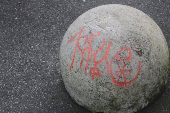
I wanted to look at tagging further and the ideas around getting your name out in any place. Because of this I decided to look at the reoccurring tags around Leeds and how they're able to make themselves so recognisable. There are a number of tags that are affective in the way they are consistently able to produce a reoccurring idea around leeds. There are three graffiti artists I have decided to focus on as I believe they successfully do this in different ways.
KERFUE uses his 'name' repetitively around Leeds. Due to the unique style of type and use of different media, his tag is both recognisable and refreshing due to each unique design. Using unique type like KFUE is a way I could both link to my brief and have an eye catching logo design.
Not only is this second frog/alien head tag visually interesting but it can be seen everywhere. Its repetitive nature means it is noticed and recognisable by everyone. Due to its unique design it's hard to know what it actually is but with a number of similarities it draw people to the design. They are often talking about its meaning and consistency making it a successful idea.
 .
.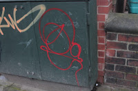
Bun City is my third example of a successful graffitI artist in Leeds. The illustrations he creates are not only big but colourful which adds to their eye-catching qualities. Their placings are in exposed spots which adds to their already successful design. A simple drawing such as those created by Bun City may work well for my logo as would be recognisable everywhere.
I need to take inspiration from the ideas and techniques of these graffiti artists to help me create a successful brief with this as an underlying topic. From this I have noted ideas on how I could create a logo and that It must be eye-catching and unique.
_________________________________________________________________________________
The first idea for my project was to create stickers. These could have my logo which people would recognise. Below this, a link or QR code to my Instagram or website which would then explain who I am and show the audience my work. These stickers would then be given to people by myself as business cards or stuck in various places of interest that would attract an appropriate audience. The below example shows how I could do this:

The second idea I had was similar to the first as leads the audience to my chosen viewing platform however I would create a poster of my logo or a piece of work. Sections could then be teared off which would work as my business card. This interactive way to show an audience my work would remain anonymous alike the stickers until the final stage of viewing my work and could also be passed to clients however has a more professional feel that my original idea. The positioning of these posters must be considered during the designing process in order to attract the right audience.
Both these designs link well with my graffiti/street art themes so would work appropriately for this brief. The next step in this design process was to decide which idea would work best for my own self branding brief. To do this I held a critique with a number of other students. I asked my group for feedback on both these design ideas. I predominantly asked which would work best to present myself as a successful and attractive designer to the right audience.
My critique group felt that each idea would work well in different ways. The stickers would be appropriate if my focus is to have my work viewed and recognised by a large audience whilst the teared business cards could be both directly given to clients as a professional way to contact me and conveniently placed to attract those I want to view my work. Because of this I feel the poster business cards could work best for this brief and is the method I would like to use for this part of the project.
_________________________________________________________________________________
To continue my themes onto my chosen media platform: Instagram I must think about how I can be unique when presenting my work. I had some ideas for how I could cohere to my themes in a professional way.
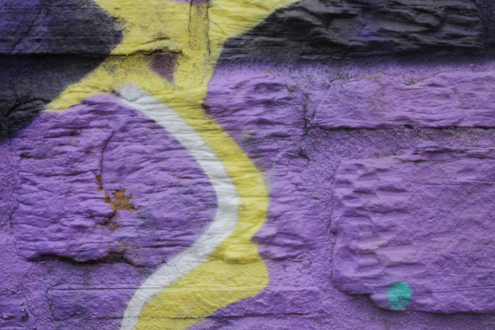
The background that I place my work on in photos could be important in presenting my work in an appropriate way. Painted bricked walls, concrete blocks among other materials would appropriately link to my graffiti/street art ideas.
These are some images i found on the internet I am using as inspiration for my own, original background
The same continuous logo throughout my Instagram will increase my audience's familiarity with my work. This means using it in my profile photo and having it present in every photo.
Although not being used within my brief so far, my previous idea using stickers could work to display my logo in each photo. This could also help me stand out as being unique. This form of logo placement is less discreet than editing in my logo which is good as I want it to be eye catching. However, the size proportions of my work my vary and the sticker may be illegible if photographing a large piece of work. Because of this I feel a digital design would work best
_______________________________________________________________________________
The logo I produce must also convey my unique and consistent themes. As well as this I feel I should run with my anonymous idea. Because of this I thought of different ways I could portray these ideas through image.
After already looking at examples of self branding by other designers I feel I have an understanding on how designers often use their own logo to communicate their ideas and own style. Despite this I looked at more examples of unique logos and self branding projects to better influence my design.
This designer uses the break up of different shapes to display his personal identity through a graffiti style. This is something done my graffiti artist to create a tag that is more interesting or eccentric. I feel this could be accomplished within my brief. I will experiment with writing my name out in graffiti styles as well as using different shapes collectively to portray myself.
I experimented with mark making within my sketchbook to start. Drawings were vague but my ideas developed into stronger designs. I made sketches of R O B and H to see how i could have both a professional yet personal logo. These are some of my first outcomes.
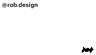
I looked further into using more geometric shapes to identify myself ending up with the combination of a triangle, circle and diamond.
Once I had created an initial shape that resembled my name I developed further illustrations of what could become my final logo design. With just an outline of my shape I made it 3D, adding shadow to show light. This developed to me adding the colour blue with a darker shade as shaddow. This is one of the colours I would like to use within my project whether it be business cards or on my website/ Instagram.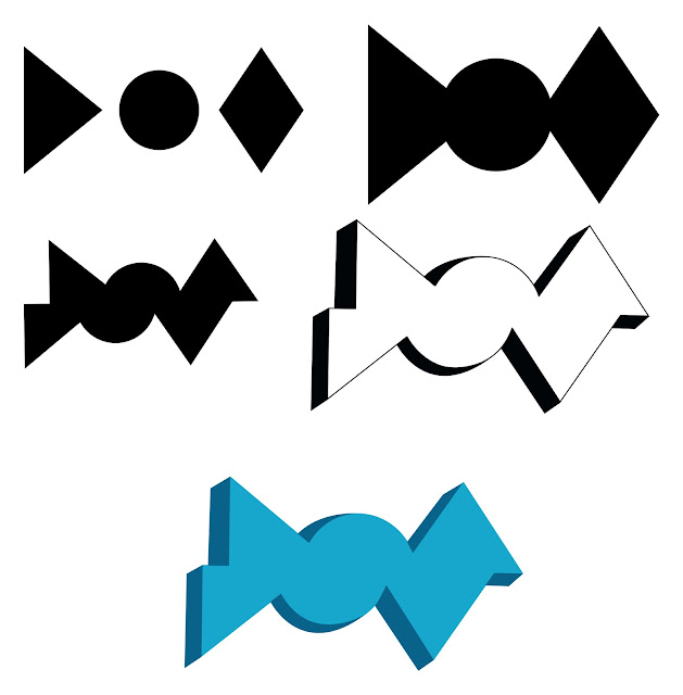
My final development saw me deleting the body of my logo by mistake. This left only the shadow. By only suggesting the shape of my name, this image for a logo may work well to better link with the anonymous nature of graffiti.
I feel my design below with rounded corners is easier on the eye than my other designs. Its works well and could be used within this brief.
I looked at creating another logo so I have a number of options for my brief. I had the idea to use two typefaces within my logo. One would be from a typeface showing my digital side and the other would show the link to graffiti. I did some initial sketches to show how I first envisioned the logo.
My logo developed through stages until I had a broad range of designs to choose from. My next step saw me asking a crit group about my designs. I wanted my logo to be simple, professional and appropriate for this brief.
My second crit focused on more detailed aspects of the design process such as which logo I would continue to use within this project and in the future. I asked the group I was in three questions relating to which design they thought would work best. The three questions I asked were:
Which design do you think best conveys the graffiti and street art ideas I wish to portray?
Which idea work well with the unique and consistent themes?
Do you think my chosen colour pallet of blues work well for this brief?
The group found my three shape design to be the most successful as was more unique than the first idea. Despite this, they felt the concept behing my first design worked well and could also be used within my brief. My critique also found my blue colour scheme to work well as the bright colours relate to the paint used within graffiti.
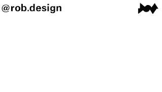
From this feedback I decided I want to work with the three shaped logo because of its unique and distinctive qualities that can be manipulated to work in the style of any brief. I developed my logo further once I had gathered my feedback to fix any small concerns about the design but feel my final chosen logo has the best outcome I could have for this project.
______________________________________________________________________________
I feel the typeface I use to portray myself should convey the ideas set at the start of the project. Because of this I have researched a number of typefaces that link to the ideas unique and consistent.
I have decided to use Univers as its curved letterforms are unique and work well aesthetically with my rounded logo design. This typeface isn't seen often but works well for my brief. This typeface will also work well for my design boards as will stand out when bold whilst also being appropriate for body text. I will also use Caslon as my headings typeface as it is unique and stands out well especially on work such as design boards.
______________________________________________________________________________
I planned to use my logo within my poster design so it could be recognised as my work. The way my poster would work as a business card means there should be part of my logo or design on each section that can be teared off. This means each card must have an interesting cover. I have experimented with a number of ideas to solve the issues I currently have with my logo such as the large amount of white space where some cards would be blank.
My experimentation for this poster design started with some of my ideas at the start of the project using continuous, repeated lines as this relates to the constant and unique themes of this brief. These hand drawn lines add a personal touch to the poster that I could use even after scanning into the computer and printing.
I first started drawing around the shapes that made up my logo. This developed to more successful sketches using my shapes as negative space. After trying this out in different ways I decided it wouldn't look as good as I had hoped so thought of other designs for a unique poster image.
At my mono print induction at uni I created a number of unique designs using basic shapes. I scanned these interesting prints into the computer and proceeded to edit them in a number of ways. I then decided to add my logo to this. I mocked these up in a variety of colours as I plan to do when printing these designs.
I feel the orange design works best for this project as it is bright and eye catching whilst not overcrowding my logo placed on top
I bitmapped my image for screen printing. This changes the image into dots meaning the closer the dot, the darker the shade appears to be. This is something I have done in the past in previous projects and has been successful so should well on my own personal project.
______________________________________________________________________________
There are a number of places around Leeds that contain a large amount of graffiti. One such place is a sewer walkway by my accommodation. With obvious links to my theme I felt photographs around this are would work best for my Instagram background. I first focused on pieces of plain brick walls with faint colours as they would contrast well against my work placed in the centre of the image.
Despite the positive colour contrasts I feel brighter colours would still work best. Because of this I started photographing spray paint up close. This would show the detail of paint peeling and crumbling off the wall in photos. I feel like these images would work best if the colour in the background photos was similar to the inner image of my work so photographed a large range of different colours so each project could have a different background colour that related it to the brief.
Below shows how i could add my work to these images.
As I have now finished with the aesthetics of my Instagram I must upload some of my work from the past yer at LCA as well as previous and my own work.
______________________________________________________________________________
One of the deliverables for this brief is to create my own colour swatch. I feel like these colours should be reflective of my theme as will be used throughout this brief as well as my work beyond this. I looked at the colours I work with most as well as those colours I like most as well as colours often used within graffiti and street art.
as are often used within graffiti and street art. These colours could be used in different ways whether it to be earthy or bright and eye catching within my design. The uniqueness of this colour pallet is something I noted as being important at the start of the brief.
______________________________________________________________________________
I had three ideas for how I could display a link to my Instagram on the back of my poster design. My first idea would just be a simple link. This could be presented in a unique way such as at the bottom of my design.
My second idea would use my own personal QR code. Despite not always considered as being attractive, this method is interactive meaning my audience are more likely to look at the link and therefor my work.
At this point I was unsure which direction to move on with the project. Because of this, I asked a number of other students their opinion on each idea.
From this feedback I found that having a link would work best for this poster as the design of QR codes can be controversial. I will use use my chosen personal typeface as it is unique and distinctive whilst also being legible. I create a number of designs that I could use as business cards.
 My chosen design is seen below. It includes my logo printed small and uses the typeface Caslon to link my Instagram account with each card. I decided to change the typeface on my business card as I now believe it better suits the design layout of my final outcome. For my final design I have also changed my type s it shows a link to my Instagram making it more clear where it directs you to. The unique layout of the card gives room for handwritten notes such as my email, number or a general note. Not only does this work well for my cards but also link to one of my attributes as a designer where I constantly use notes and sketchbooks to influence my work. I also added a box around my design as not only links to the other side of the poster but contains my designs meaning they're easier to read and produce when I cut them out.
I made sure the design was the correct size for a business card and copied the design repeatedly over a A3 document on photoshop.
______________________________________________________________________________
I have had the idea to screen print my posters. This way I can again link to my theme. Each poster could be a different colour yet have the same design.
My recent screen printing workshop has inspired this idea as was something I have enjoyed. I have booked two screen printing sessions to complete my posters; one for each side of the design. I wanted to create three variations of my posters. Each of these will be screen printed different colours. I want these colours to be eye catching. These could also relate to the themes chosen in my brief.
Before my sessions I looked at the colours available for this printing method. Due to the use of acrylic paint there is a large colour choice available so have decided to use a blue from my colour swatch. I have chosen this colour as is eye catching for this type of poster, similar to colours used within graffiti and are used less often within poster design.
______________________________________________________________________________
I need to consider the stock that I print my poster on. It is important for these posters to be thick so they work well as business cards. This will prevent damage in wallets and bags and be less easy to bend and crease. I must also use a paper stock that will soak in the paint when screen printing. I found out which stocks of paper I could use for screen printing which narrowed down my choices. I eventually decided to use a Snowden stock at 300 gsm.
As well as working with my other requirements, my chosen stock is a particular white to avoid a change in paint colour. The next step in this process is to print my designs. I will experiment with shades of my chosen colour pallet as well as how much paint I apply to the paper. As a theme of mine is unique, I can be expressive in my approach to this printing process.
I will focus on my favourite and most aesthetically pleasing prints to use as final posters. I feel this will lead to more eye catching posters and will again link to my unique brief.
________________________________________________________________________________
My screenprinting process didn’t go as well as I would have liked. I bitmapped my poster so the gaps in emulsion on the screen were very close together. This meant there was little time between prints before the paint soaked into the screen. Because of this, I had to repeatedly wash my screen between prints. Unfortunately, due to limited time and money, my final prints came out a little faded and blotchy. The reverse side on all prints was also a little out of line. This meant the tear lines would not be straight. Despite first thinking this was a bad mistake so late in my project, I noticed how it linked well to my themes consistant and unique. Because of this I have decided to continue with my business cards and will photograph the results.
My next task is to create the dotted tear lines in my prints. This will mean people will be able to take one of my business cards and visit my Instagram. This will be done with this tool below. I will first experiment with the tool as I feel it could be unpredictable and hard to use. My first practices will be done on my rejected screen prints as may still be used if I mess up my finals. Once I had more practice with the tool I was able to accurately create the marks on the paper making the posters ready for hanging up.
_________________________________________________________________________________
For this brief I am asked to create a layout for my presentations and design boards. My previous layout used Helvetica as its typeface with a three column grid system used throughout. An example of this layout can be seen below.
Although successful in presenting my work I feel I should adjust and change some aspects of my layout to better work with this self branding brief. One way I could do this is by adding a small version of my logo somewhere on the page.
Another way I could link my presentation layout with my brief is to use my chosen typefaces. Although not used often, Univers works well for legibility in body of text with Caslon standing out when bold in the headings.
_________________________________________________________________________________
These are my final photographed posters. I must consider where I place my posters as it is important when identifying whether my target audience is aimed towards jobs or acquiring more personal clients that I can work with more on a short term basis. My aim for these posters was to increase the familiarity of my work with other creatives so I am able to involve myself in more competitions, collaborations and other interesting parts of design. Because of this I have considered a number of locations for my posters. One such place being inside uni where a vast selection of creative would be able to view the posters. There are also a number of places around uni that my poster could be placed making it more inviting and recognisable to my target audience. Another place I could place one of my posters is at our exhibition in May as there will be a constant flow of creatives walking throughout the space. If my poster could be seen alongside my work I may get an influx of activity on my portfolio of work on Instagram.


I feel my final self branding outcome successfully portrays myself as a designer. Using street art and graffiti as a major influence within this brief has meant I have been more interested in what I am doing and had more ideas to influence my work. It has also meant I have a logo and overall project that is coherent to my already recognised attributes: unique and consistent. I continued these ideas across my social media and business cards. All of the media I used for this project works together due to its consistency.
Altogether I feel this project has been successful however there are things that I wish I had done differently within the project. One of which was the screen printing as still wish they had turned out as originally intended. Although my final outcome worked well in conjunction to my themes of unique and consistent, I feel it would have looked more professional if the business cards were in line with the front print.


